Building a scalable, 0-1 design system on a shoestring budget in four months.
My prioritized ask:
Develop Nuveen’s first design system in four months, supported by a small design team.
The ask
This ask was created by myself as the number one priority when I joined. As Head of Design, I led a small team of consultants and Nuveen designers to create the Trellis Design System from zero to one, and with success KPIs achieved a 2.0 version with adaptive components.
The work began nearly a month into my joining Nuveen as I quickly assessed the Adobe XD system was lacking connectivity, accessibility, and scale benchmarks we needed for our brand deployment on SiteCore.
The challenge
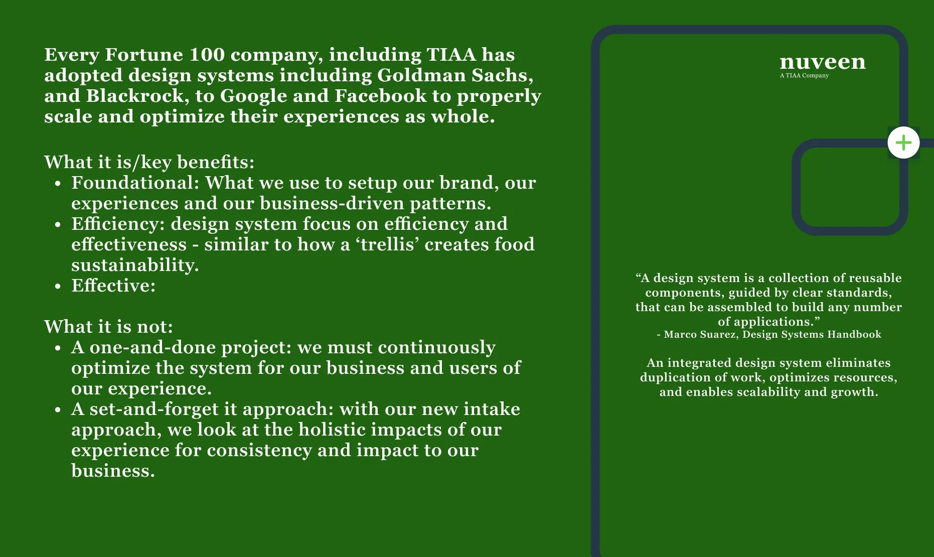
Every Fortune 100 company, including Nuveen’s sister company TIAA had adopted design systems by 2024 including Goldman Sachs, and Blackrock, to Google and Facebook to properly scale and optimize their experiences as whole.
Nuveen had no design system in place. Compounding the issue, they were in Adobe XD with no linked cloud support and needed to migrate to Figma quickly with a foundational carry-over from Adobe XD.
There were only two designers on the team when I joined, both had no Figma knowledge or design systems knowledge.
On the upcoming next year (2025) roadmap: a complete rebranding of Nuveen that would need to scale.
The original XD file the design team was using at my start
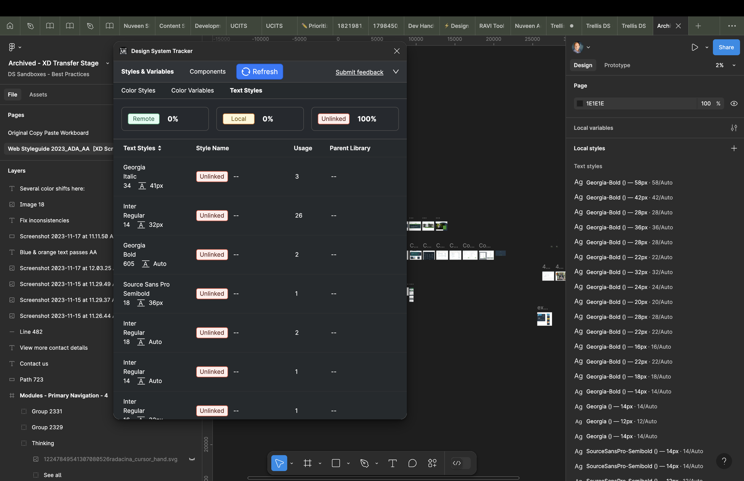
No components were linked in XD, causing us to start over in Figma
No components were linked in XD, causing us to start over in Figma
Some metrics used for buy-in
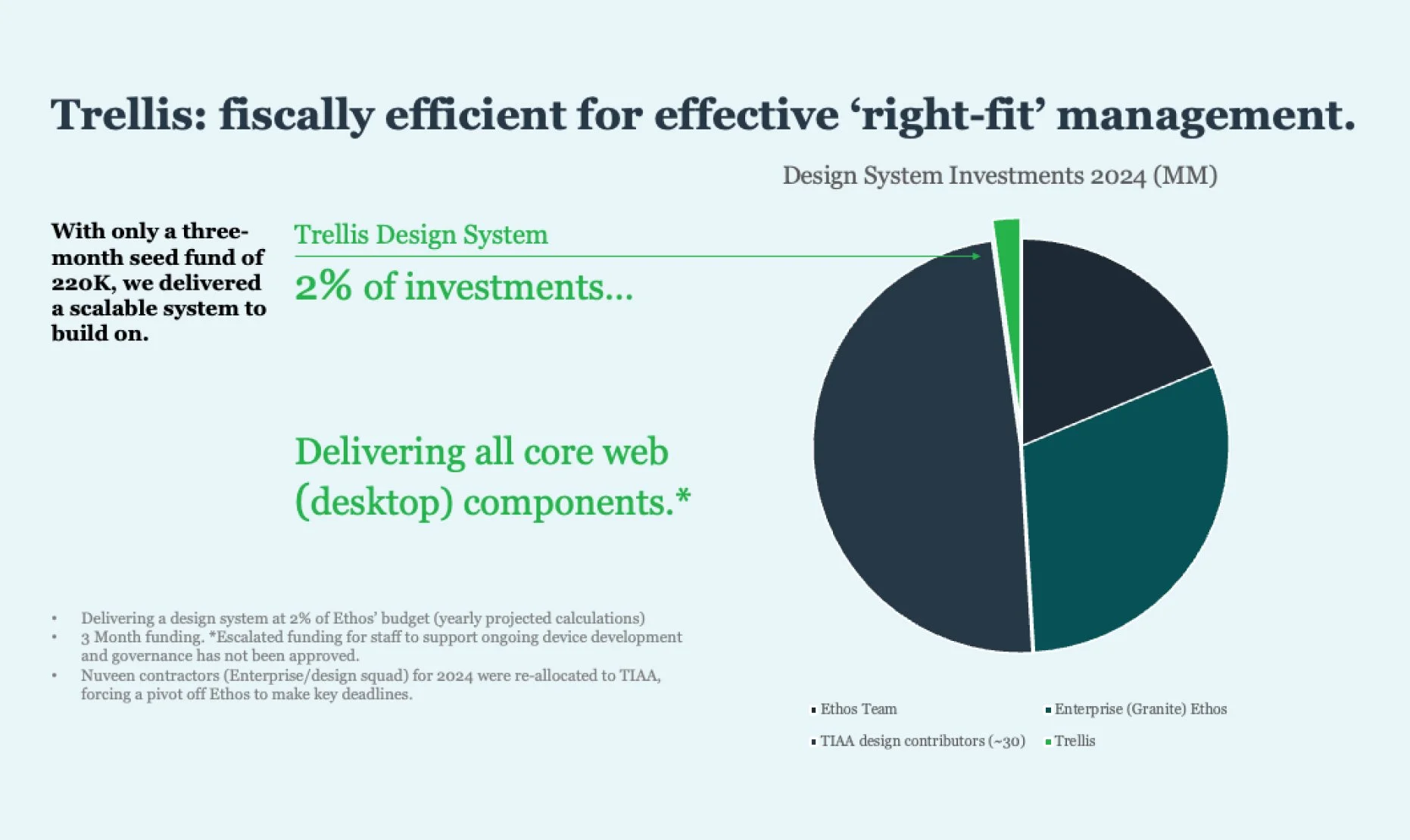
percent of the total estimated budget we were asking compared to our sister company’s design system yearly budget.
2-3%
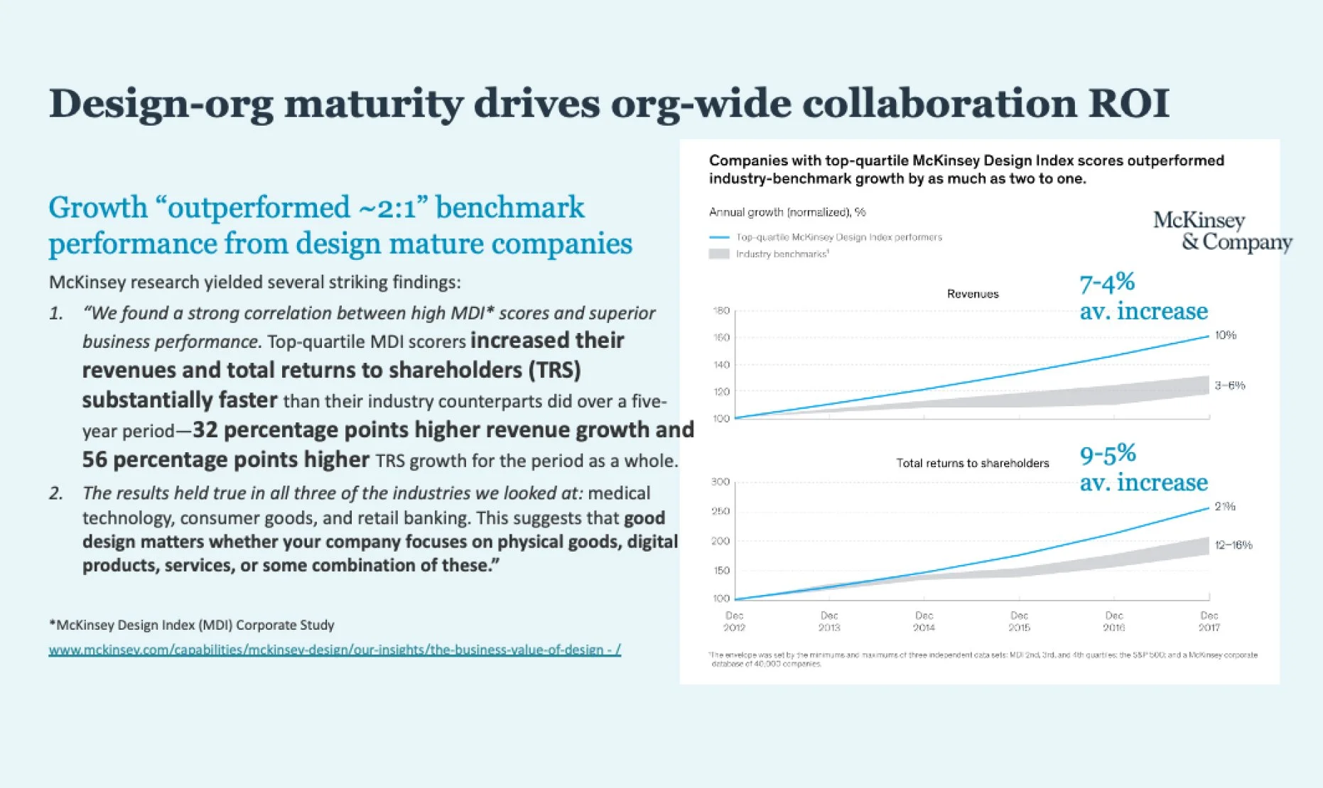
increased their revenues in design mature organizations over non-mature competitors - 32 percentage points higher revenue growth (McKinsey report)
7-9%
increased total returns to shareholders (TRS) substantially faster over non-design mature organizations - 56 percentage points higher (McKinsey report)
5-9%
The org. challenge
Anxiety: This had never been done at Nuveen before and we had limited team bandwidth with only two staffed designers managing weekly site updates.
Success confidence: Figma migration had not yet occurred, so it was already a big shift and adding one more major change management factor drew much skepticism. Only two months into my new job, I was escalating the urgency with trust in this effort.
Awareness: The value of a design system was only somewhat known at the sister company TIAA. In addition, what was being shared from our sister company was the complexity and cost of the work.
Education: There were no technical, leadership or UX teams that had systems knowledge within Nuveen. Sitecore development was being handled by a third-party consultancy. A great deal of cross-team education was needed to avoid blockers and false red flags.
Baby shoestring budget: We could only spend 2% of TIAA’s systems (Ethos) budget they spend.
The plan
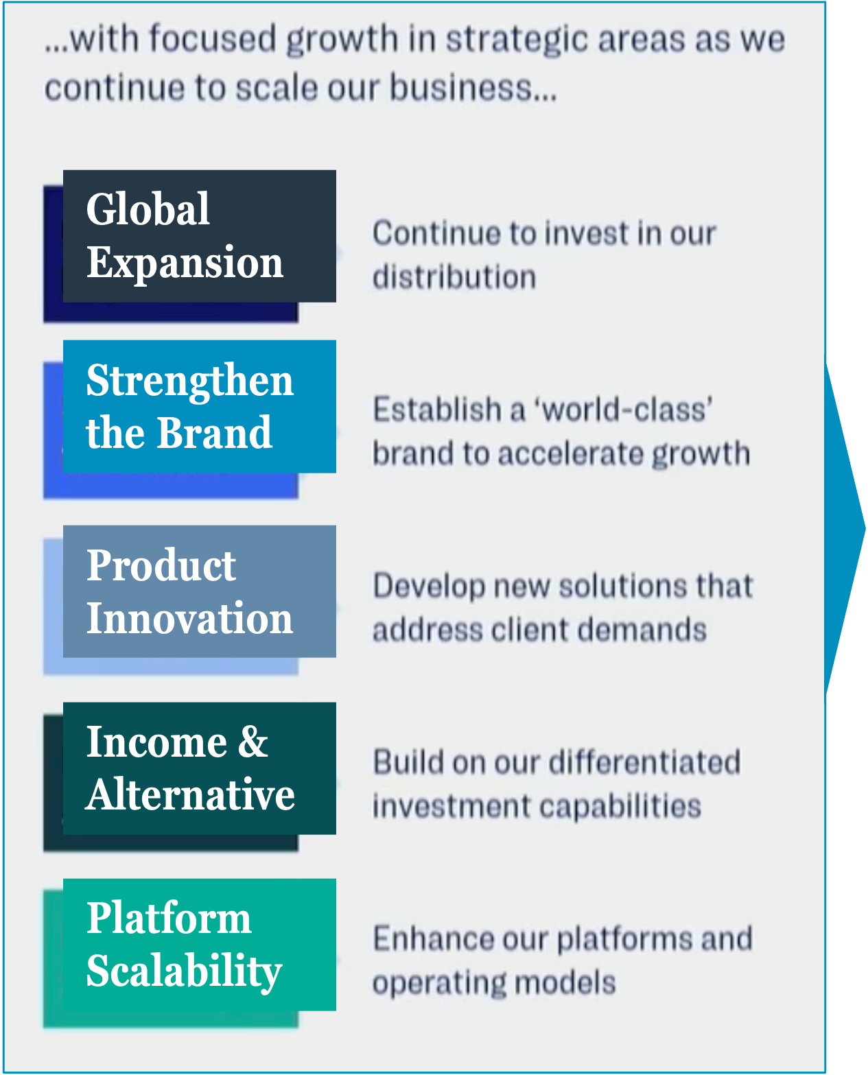
I initially began organizing a roadmap while also educating leadership on how a design systems would improve development costs while laying the foundation for a Nuveen rebrand that was just underway. Urgency and a small budget was sold into senior leadership by connecting the design system goals to marketing and product’s 2025 KPIs. Their success required our success.
The 0-1 Approach (some in parallel)
Audit the site to the current Adobe XD components for gap analysis
Evaluate current metrics on most common use components to prioritize
Collect all updated XD components and export to Figma.
Train UX team in Figma. Begin assigning small sample projects of systems to exploration.
Train UX team in systems design using Figma.
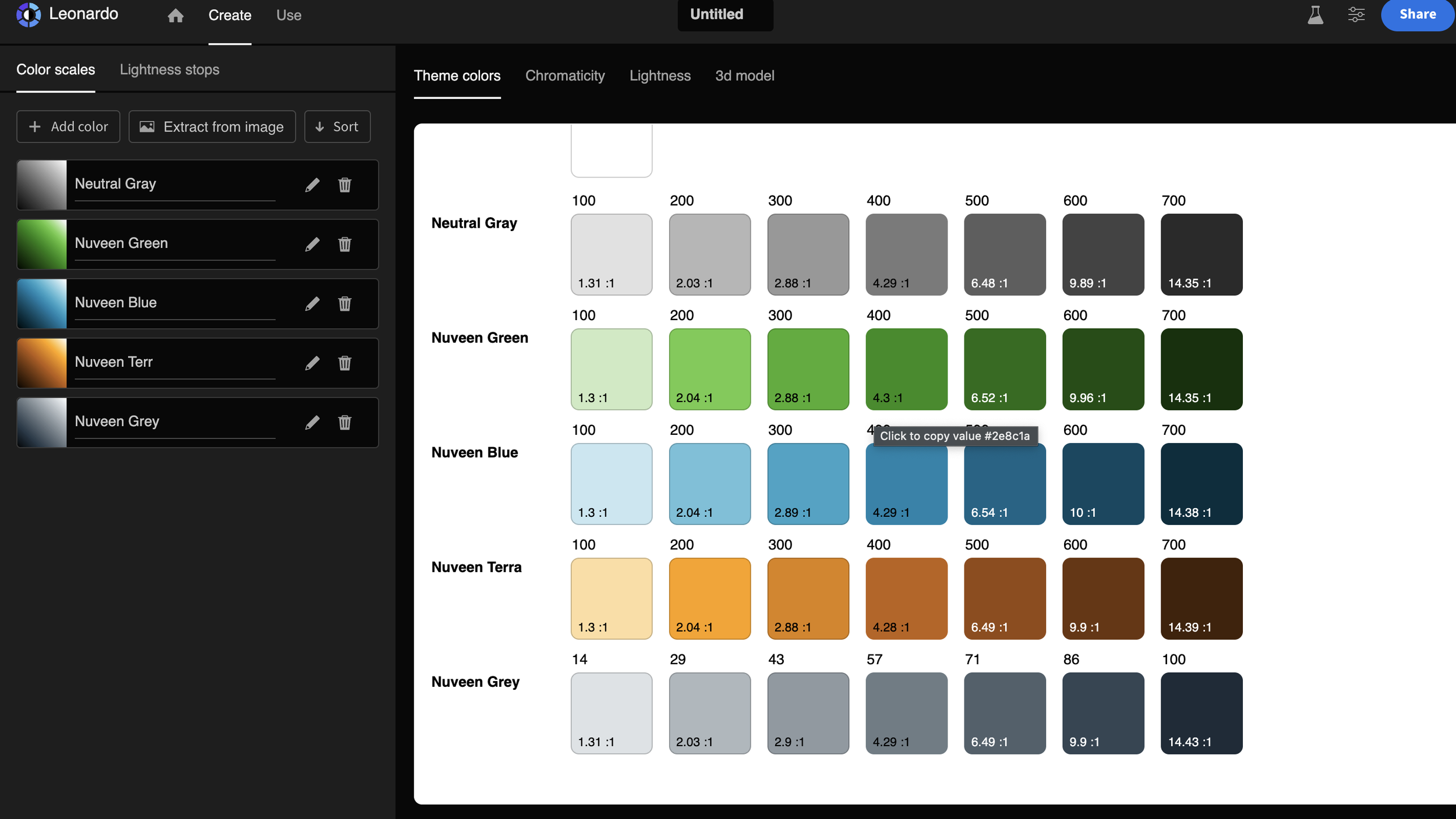
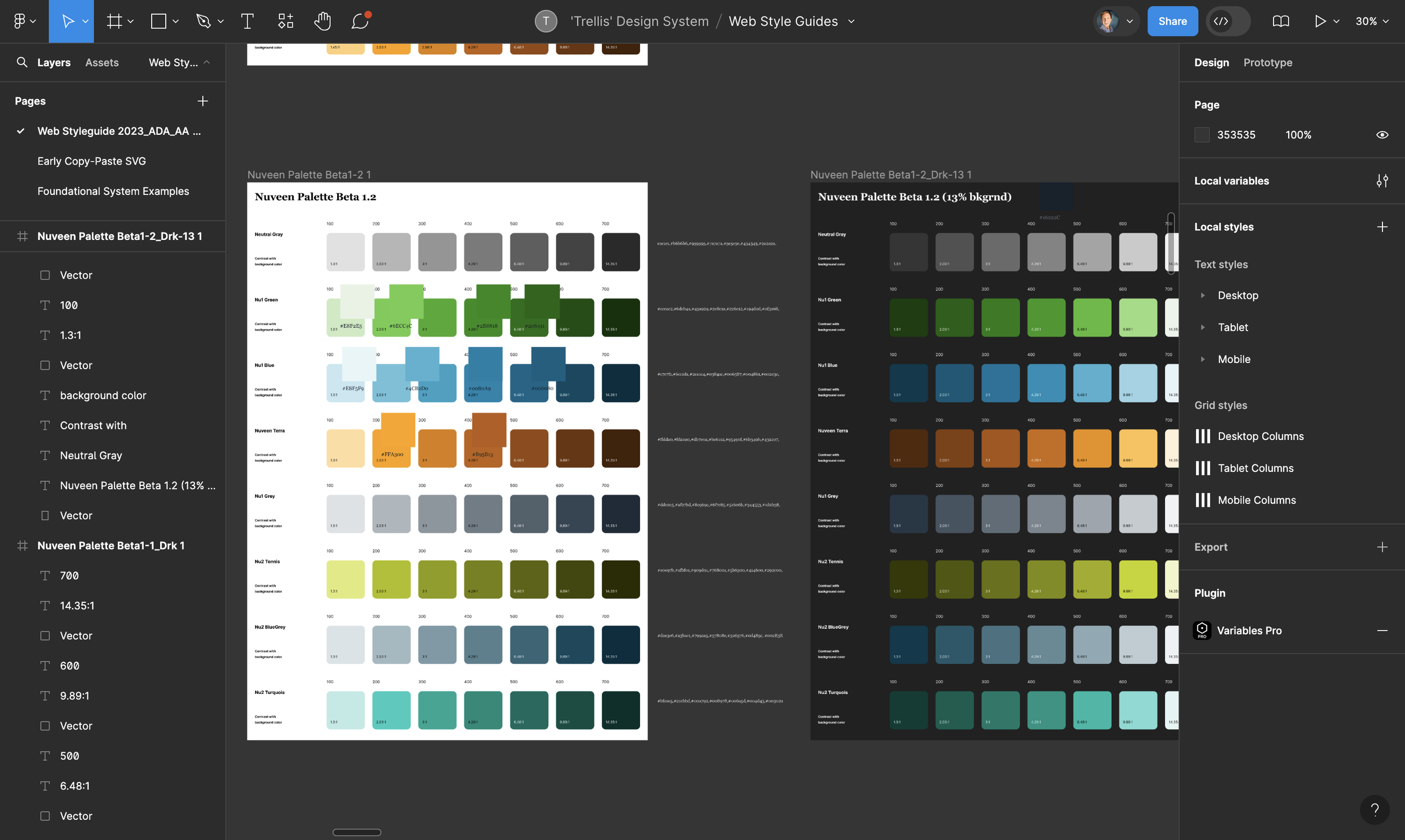
Begin fixing all component layer errors in Figma. Begin basic mapping Tier 1 palettes and identify gaps
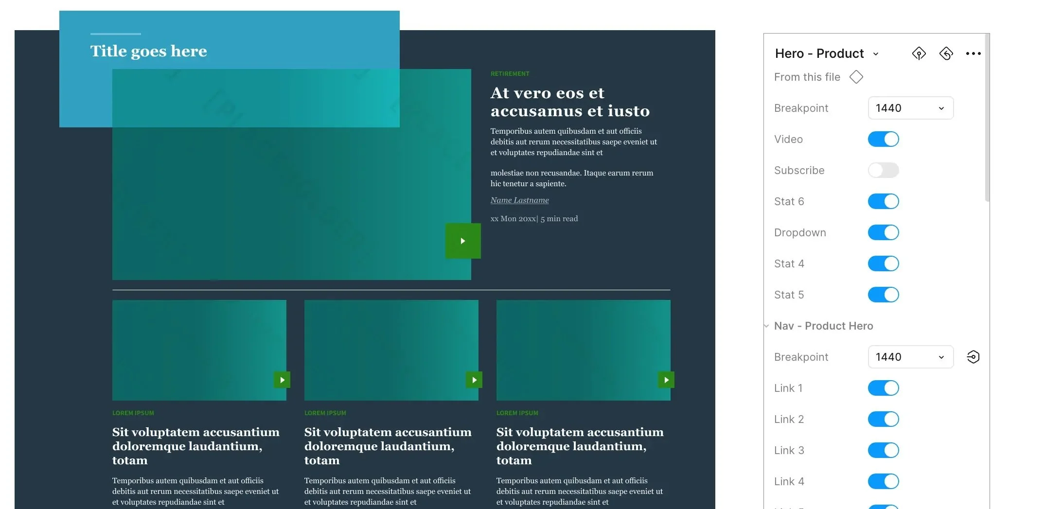
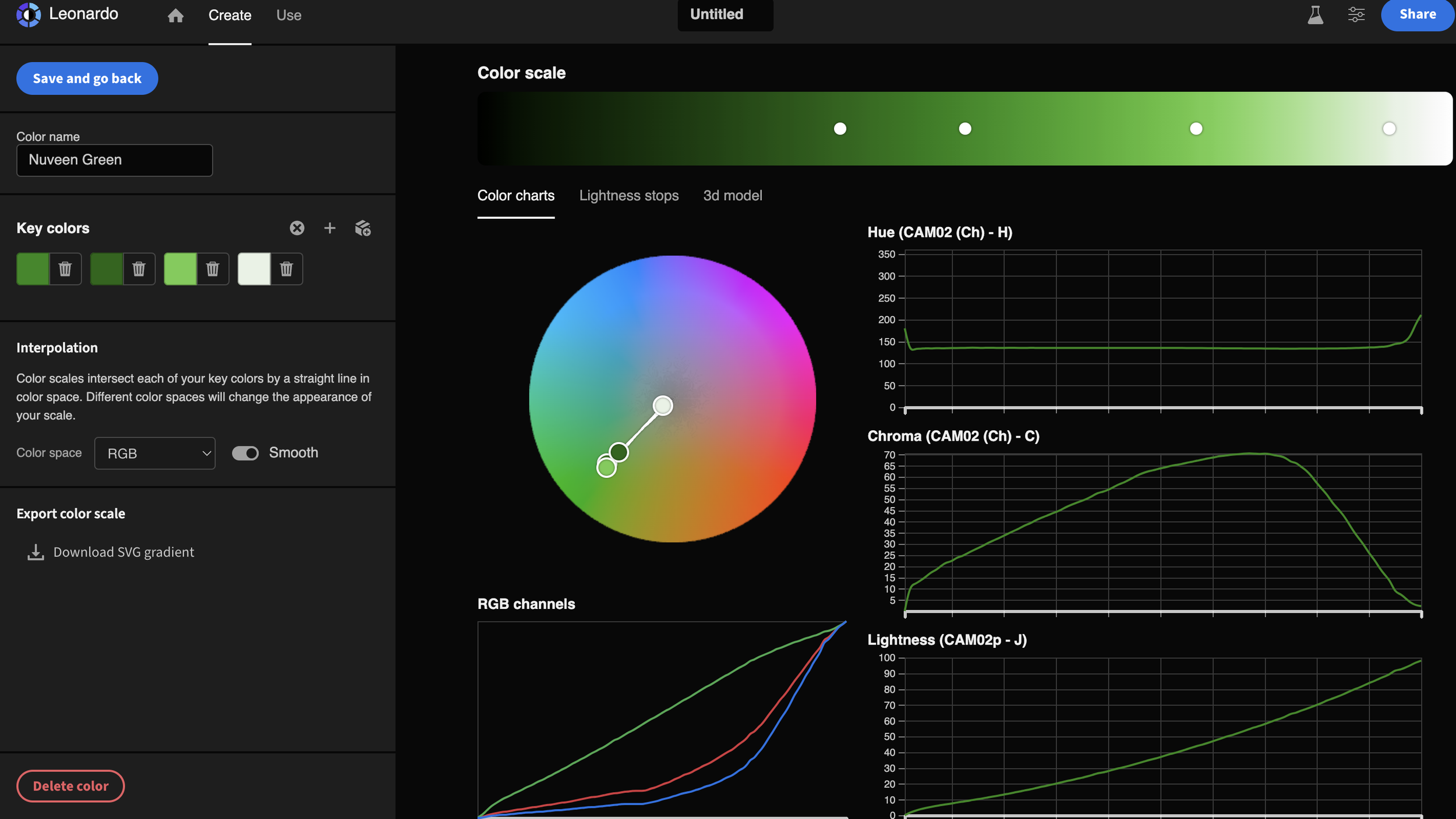
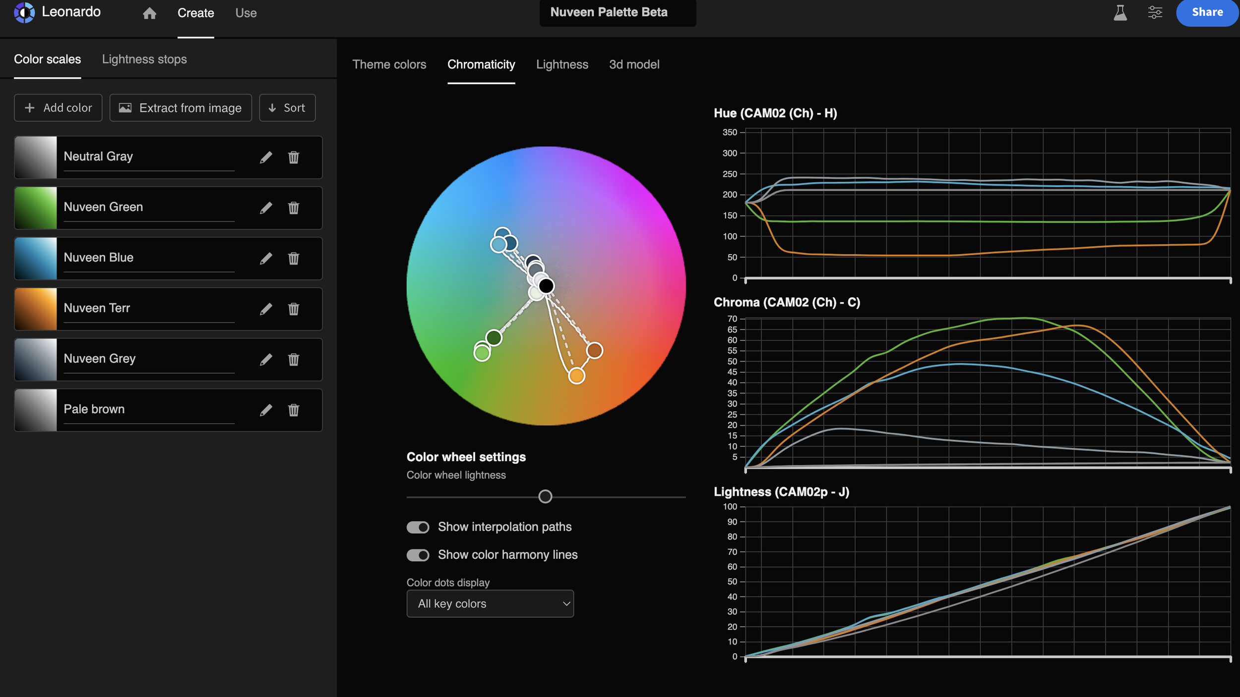
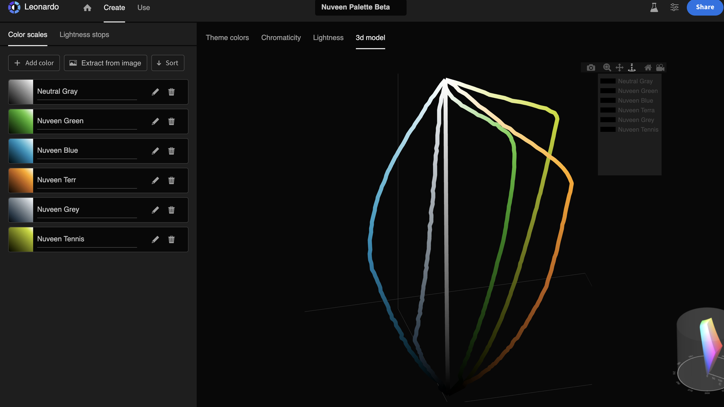
Develop the system palette from (only 9) branded spot colors including all palette classifications of primary, secondary, and tertiary. Define rules.
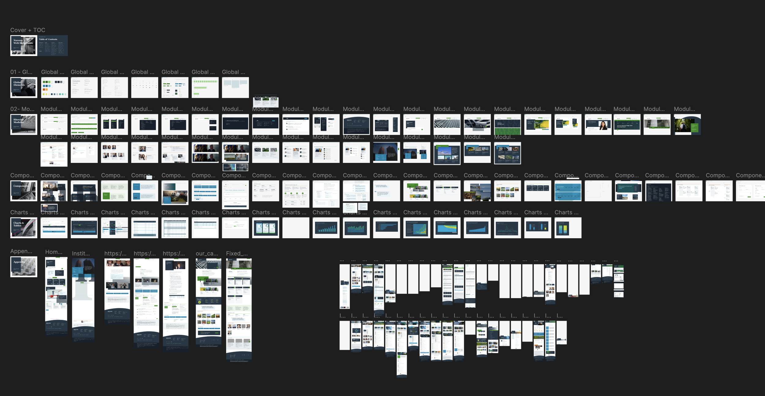
Reorganize the components and identify variants in the system architecture for planning
Audit the atoms, molecules and components in an excel doc for change management
Stakeholder meetings on status updates and platform milestone alignment
Onboard the two systems contractors to begin developing foundational atomic development. Migrate from Tier 1 to Tier 2 semantics.
Develop system file architecture and guidelines for usage
Finalize variants of atoms and molecules with usage testing
Finalize components with Tier 2 semantic architecture
Finalize Figma systems components and content
Finalize content legal compliance.
Foundational token guideline handoff to development, storybook documentation.
Systems design component development handoff documentation
Conduct a “road show” on value and education: efficiency and effectiveness improvements.
KPIs
Connecting the org metrics with system success.
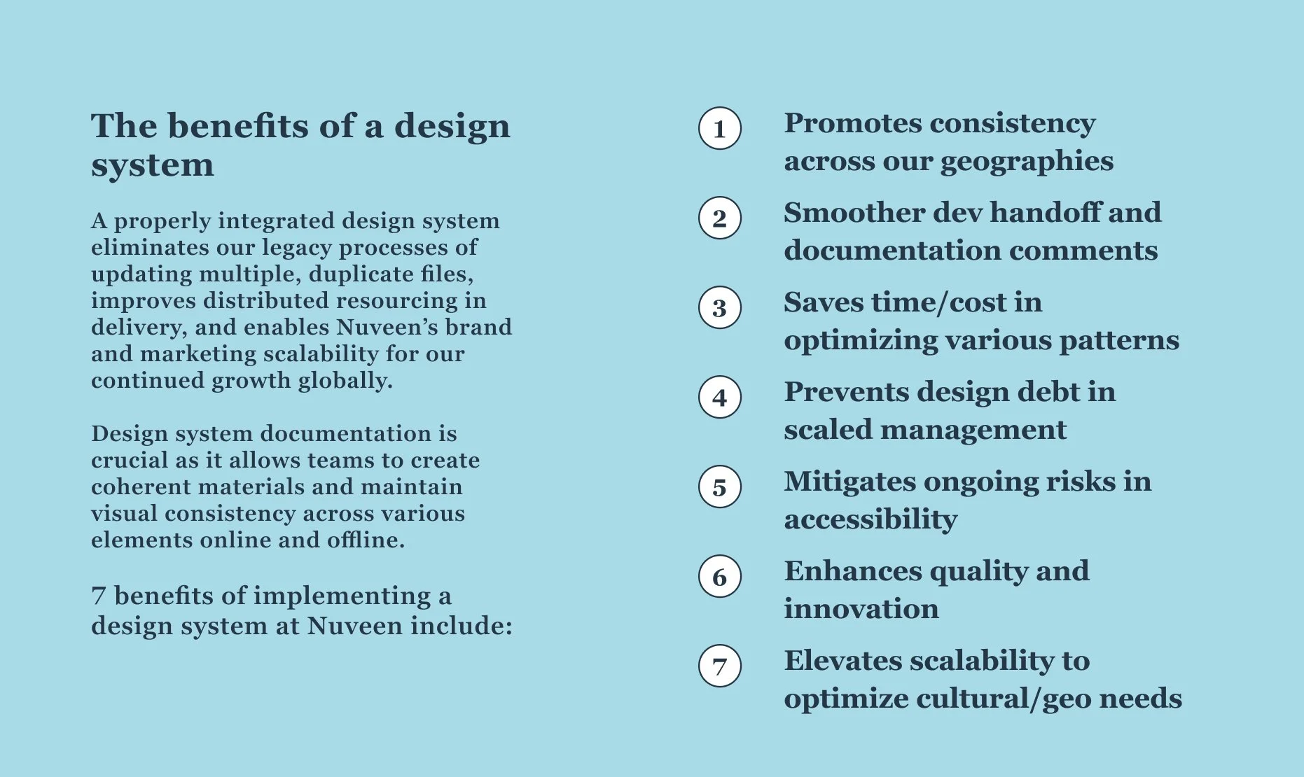
Efficiency
Global collaboration to branded experiences
-
Reducing/eliminating ‘design debt’: UI components for rapid, high-fidelity ideation that push cloud updated work
-
Documentation: Brand guidelines and usage: for development QA, site uniformity to reduction of development costs
-
Uniformity: Drive creative delivery consistency across modern multi-displays with any external development partnerships
-
Positioning: scale design work as brand positioning evolves or adjusts (color, style, creative)
-
Speed: With robust web components in the future, we can ideate faster on the most optimal experiences, focusing on the business goals – rather than developing components from scratch.
Effectiveness
Team clarity with scale
-
Marketing clarity: Enabling rapid ‘design thinking’ workshops/collaboration with content, marketing and enterprise teams.
-
Cross-channel site experiences with embedded research testing and roadmap planning to drive greater brand engagement and journey facilitation
-
Gap analysis: by identifying components that are ineffective or missing for research testing or further development.
-
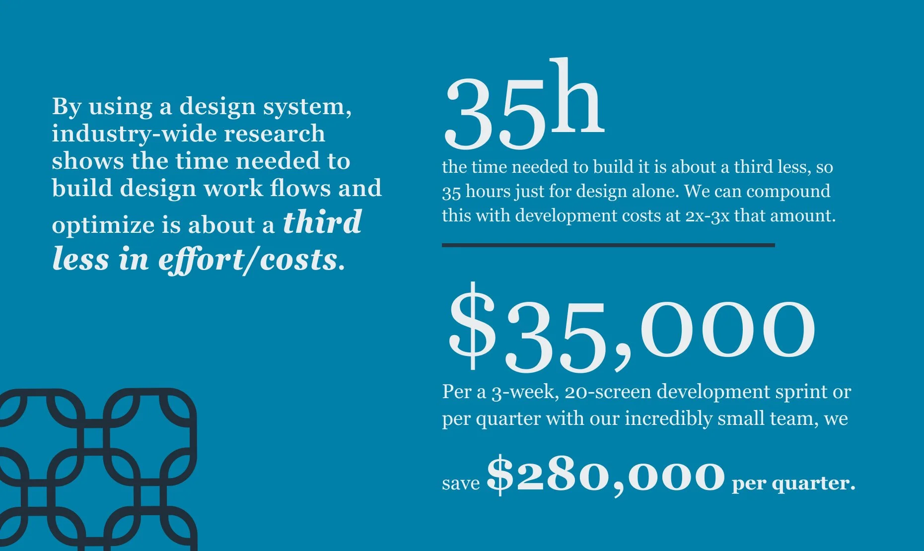
Reducing design costs: Nielsen-Norman found that time saved to update UX experiences with a design system it is about a third less which can save $35,000 for an average 10-screen experience.
-
Personalization: defining recommendations on variances to experiences from incoming channels for various persona/segment support
Executive educational primer for funding.
Primer: Business Value
Foundational Palette: from analysis to Execution
Brand Spot color mapping
Multiple palette stepping analysis
Spectrum refinements
Early Ideation number 5
Expanded palette with dark support
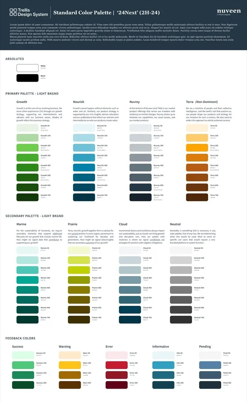
Light/Default Tier 1 Palette Tokens
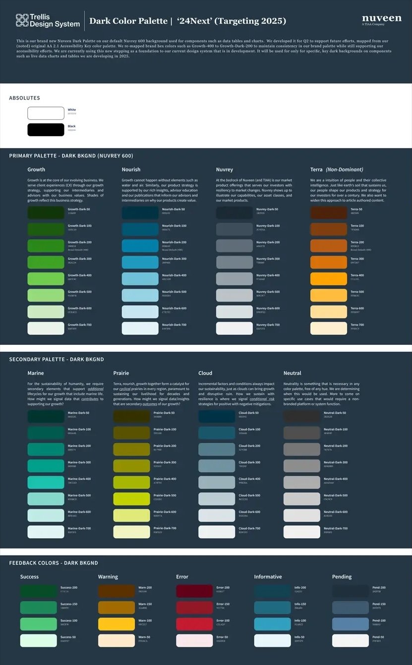
Dark Tier 1 Palette Tokens
Semantic Tier 2 Tokens
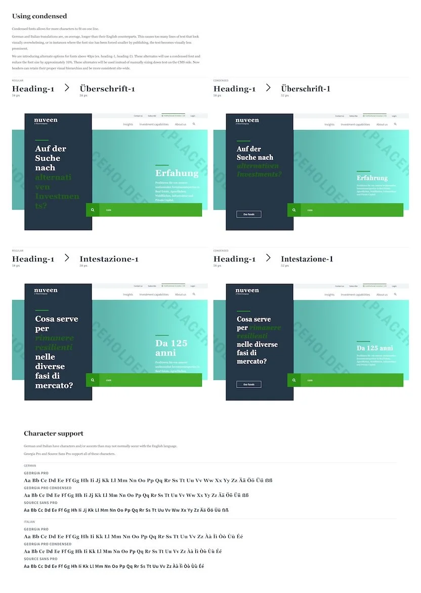
Foundational: Global Typography
English (Default)
German
Italian
Korean
Japanese
Chinese (Simplified)

Typeset English XL-L

Typeset English M

Typeset English S
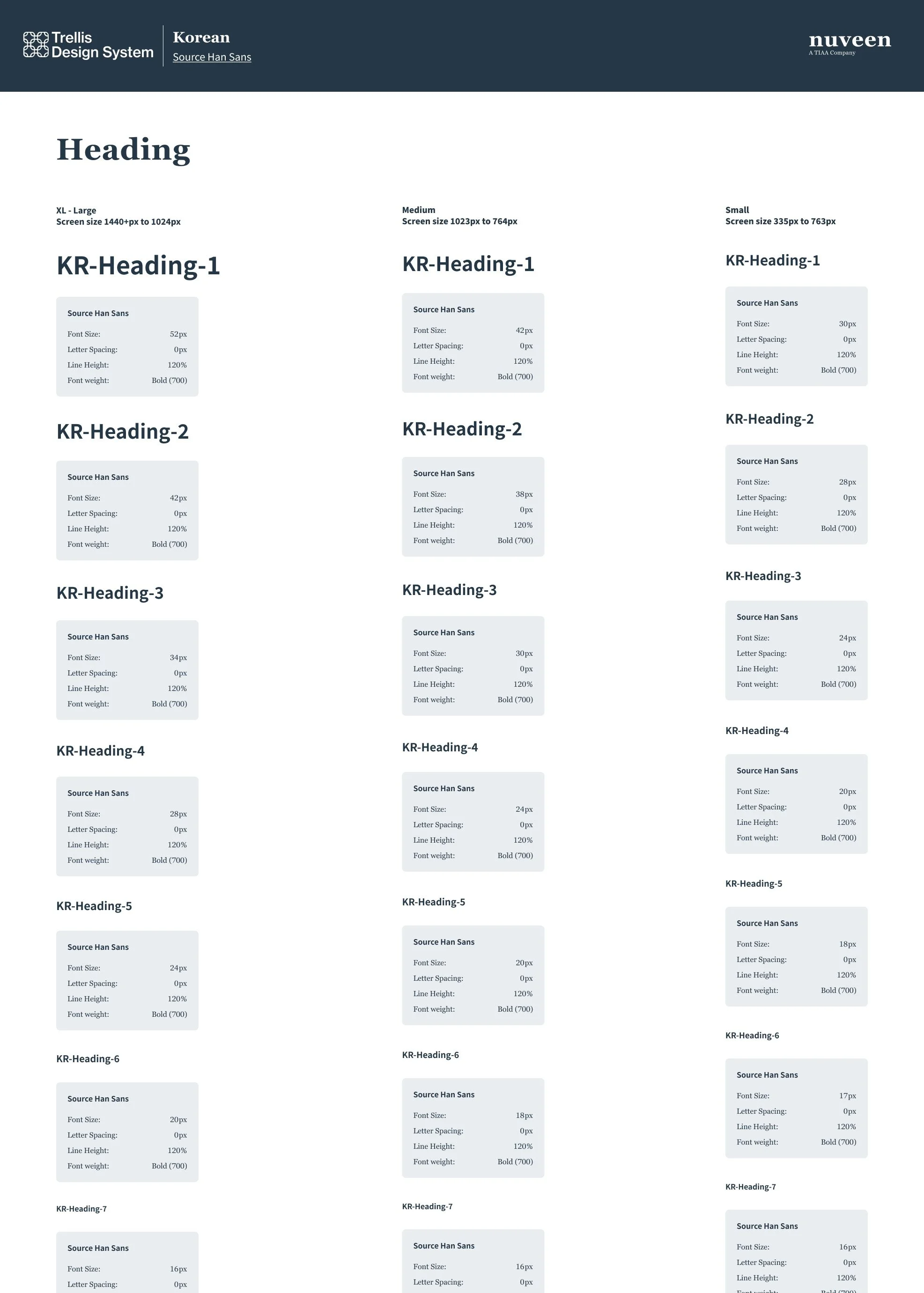
Trellis Korean (Cropped)
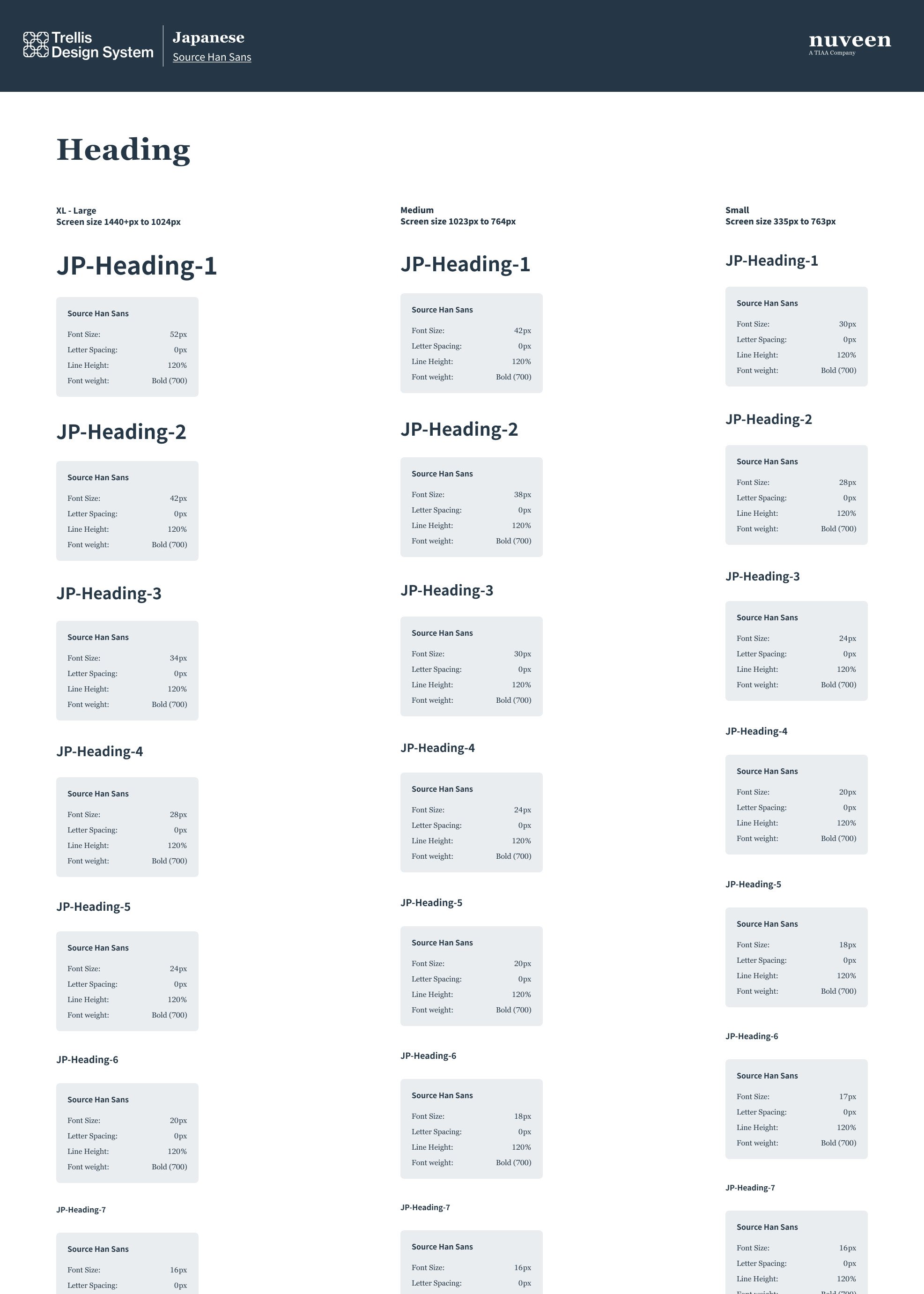
Trellis Japanese (Cropped)
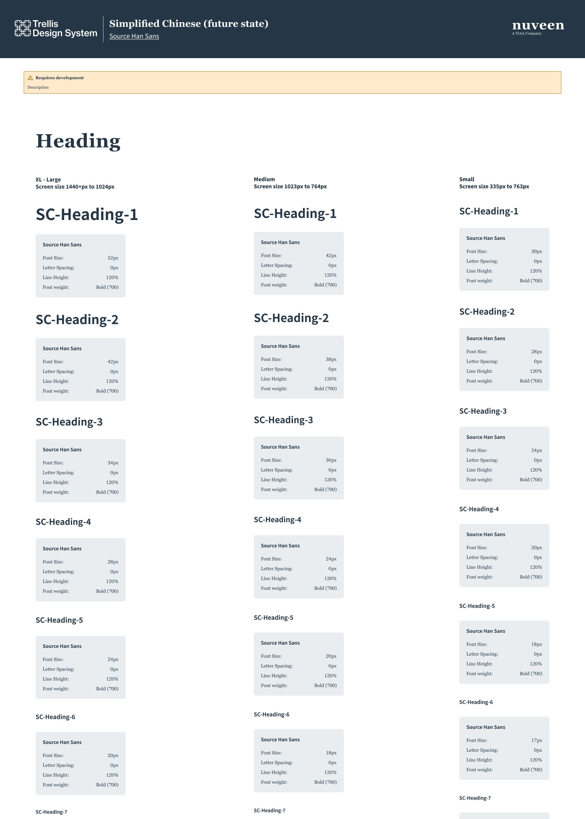
Trellis Simplified Chinese (Cropped)
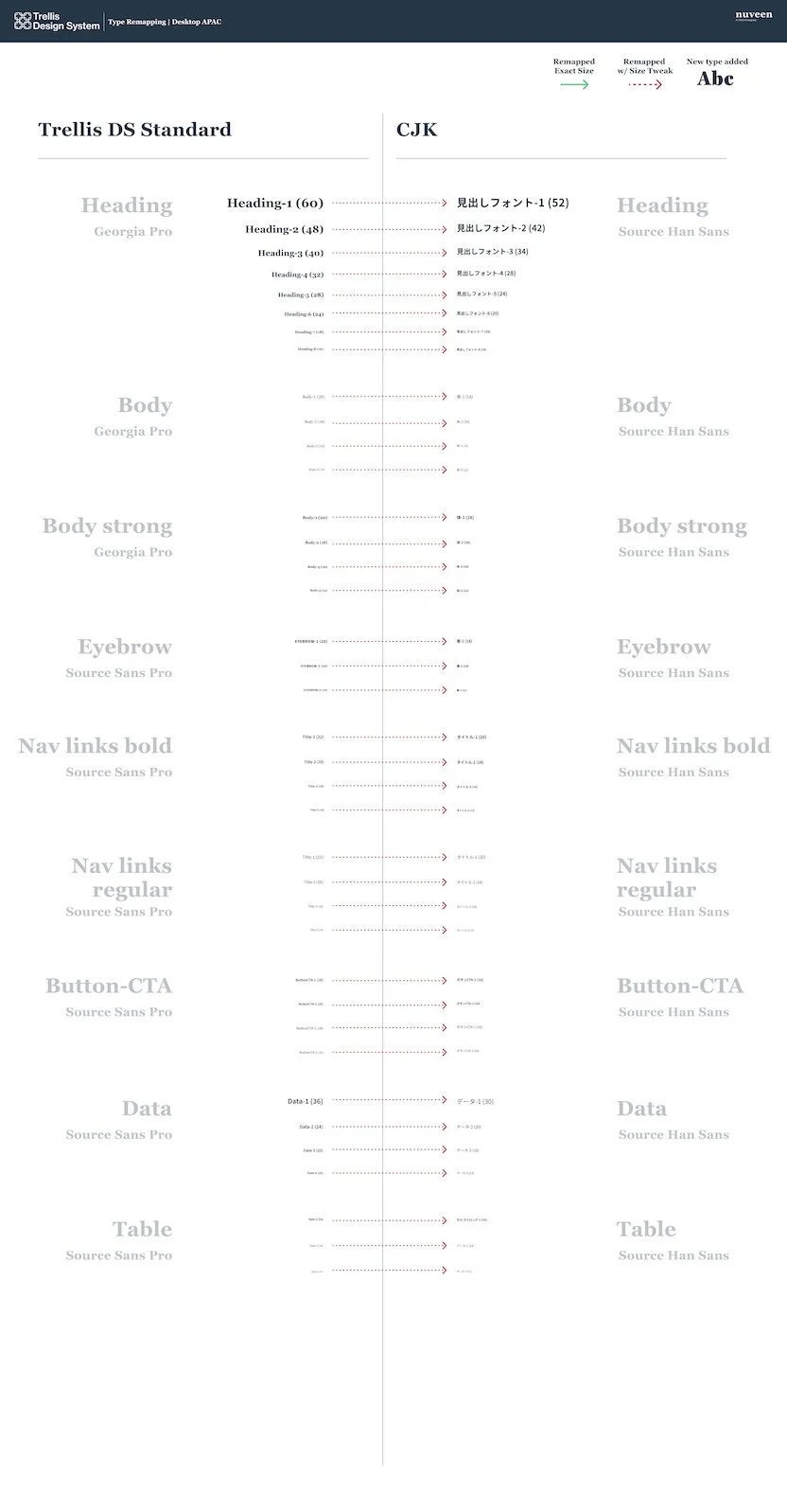
Global Font Conversion
Documentation Examples
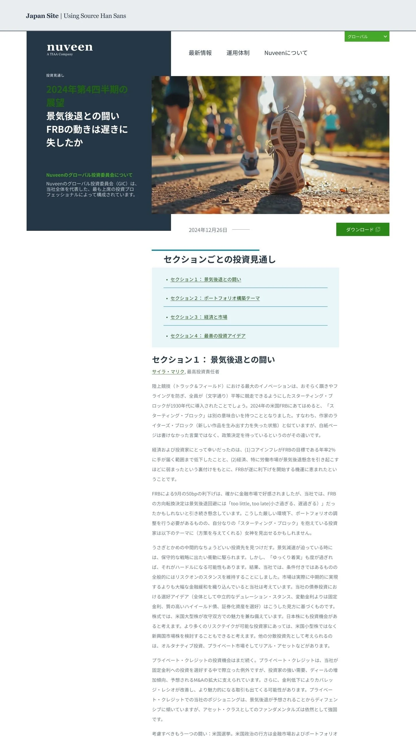
Japan Site Example
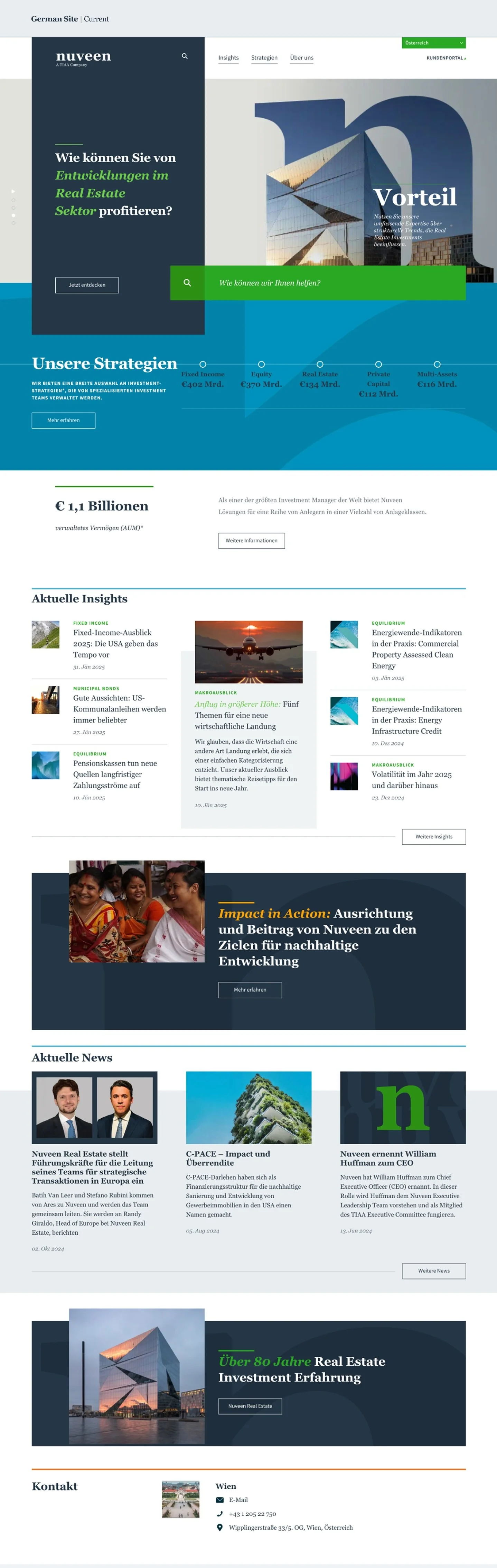
German Site Example
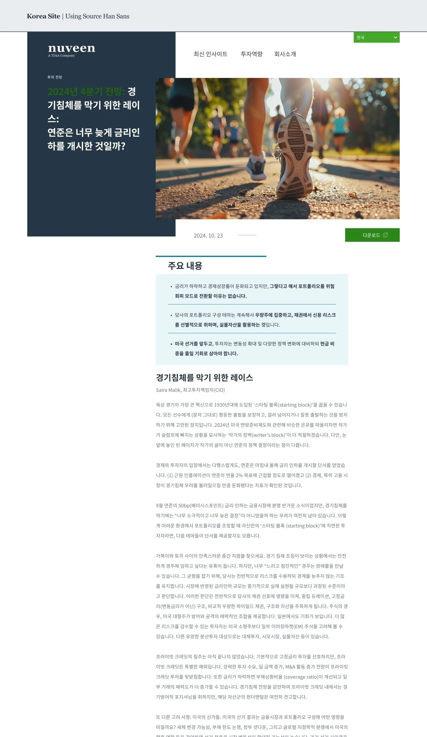
Korean Site Example
Foundational: Tokens
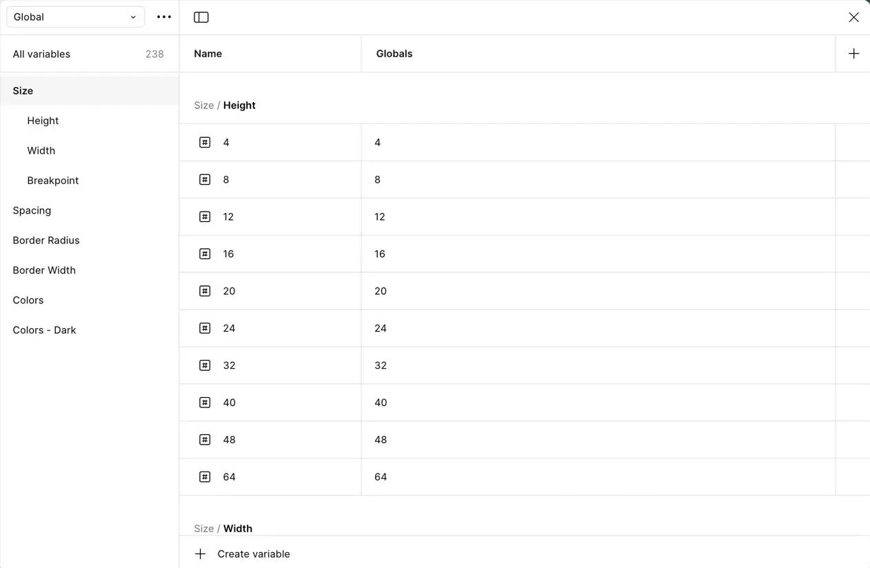
Early Sizing Tokens
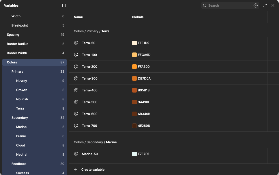
Tokens Tier 1
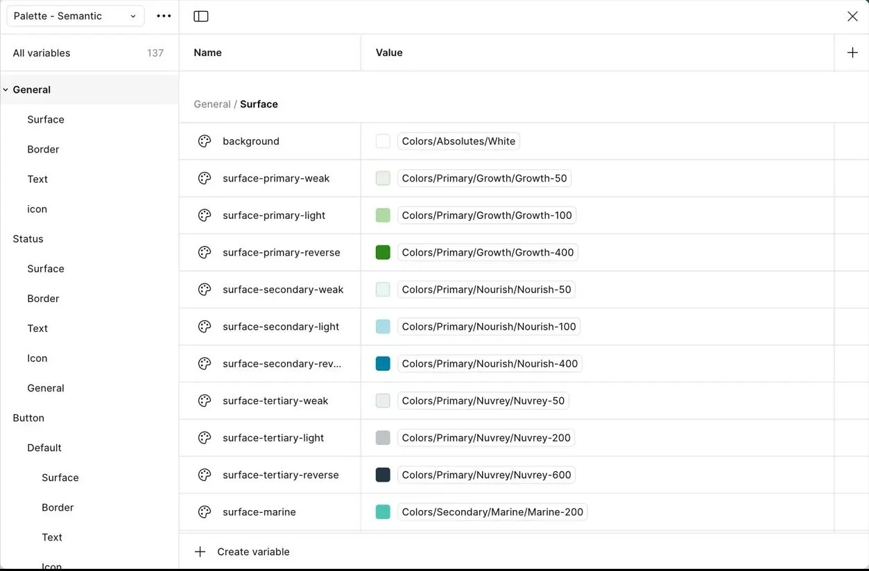
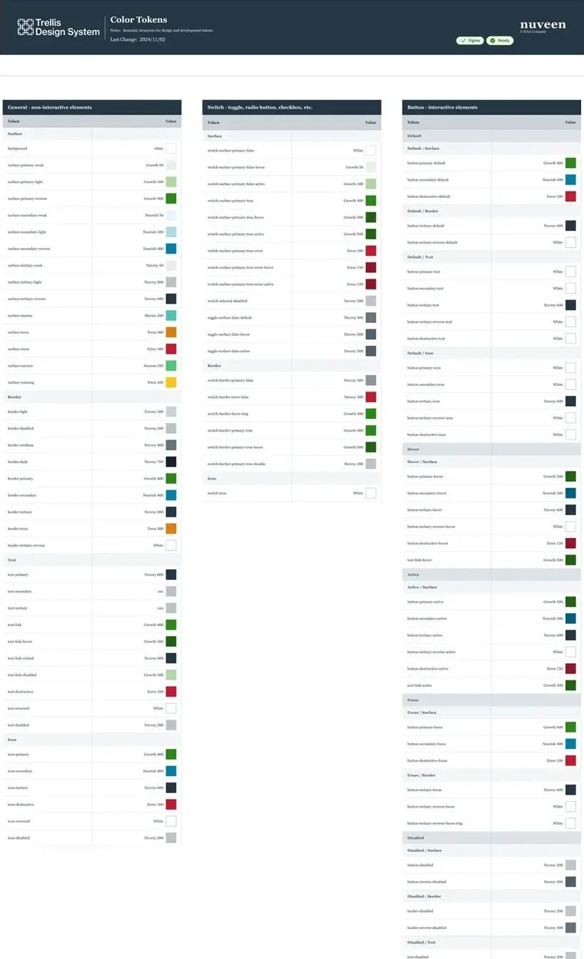
Early Color Tokens Tier 2 Default
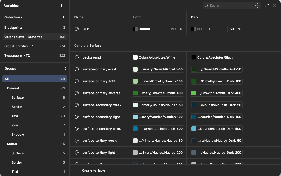
Color Tokens Tier 2 with Dark
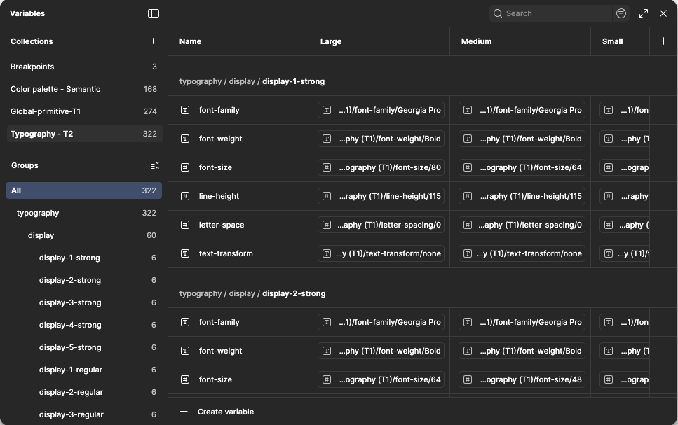
Tokens Tier 2 Typography
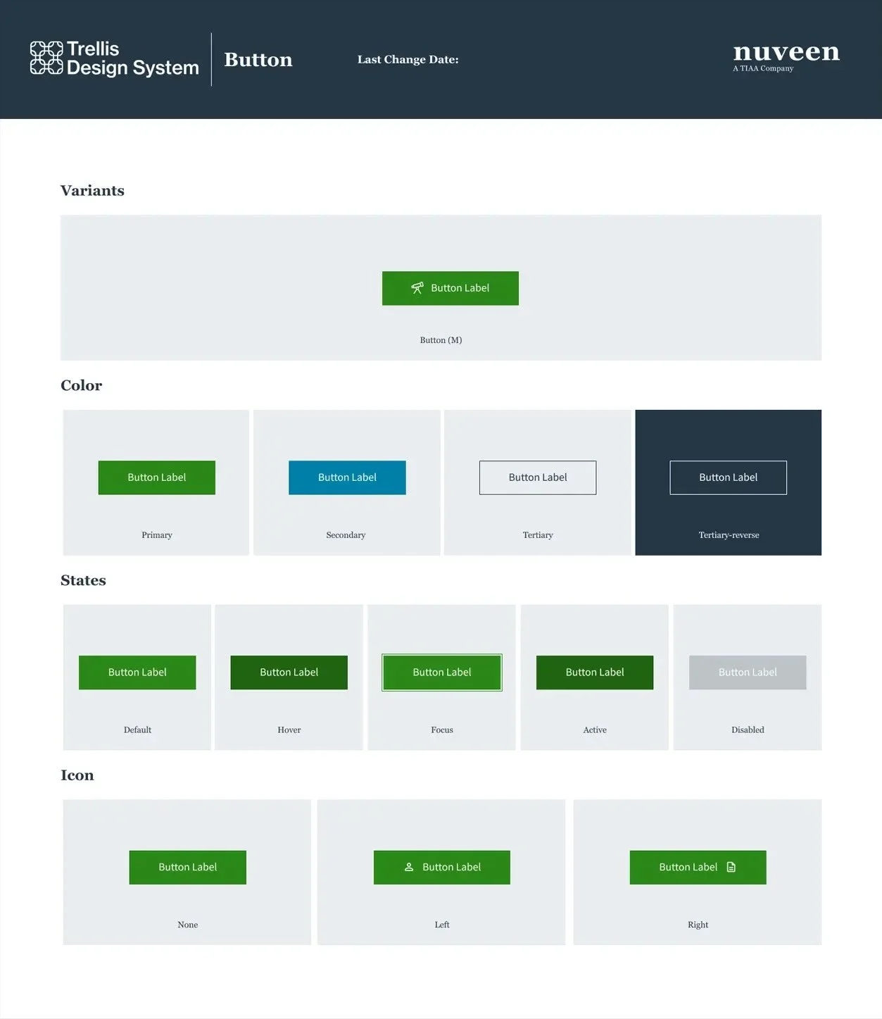
Atoms: CTAs
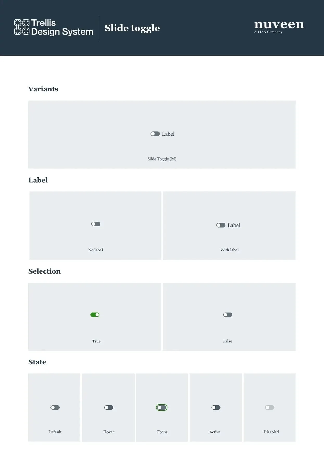
Molecules: Calendars and
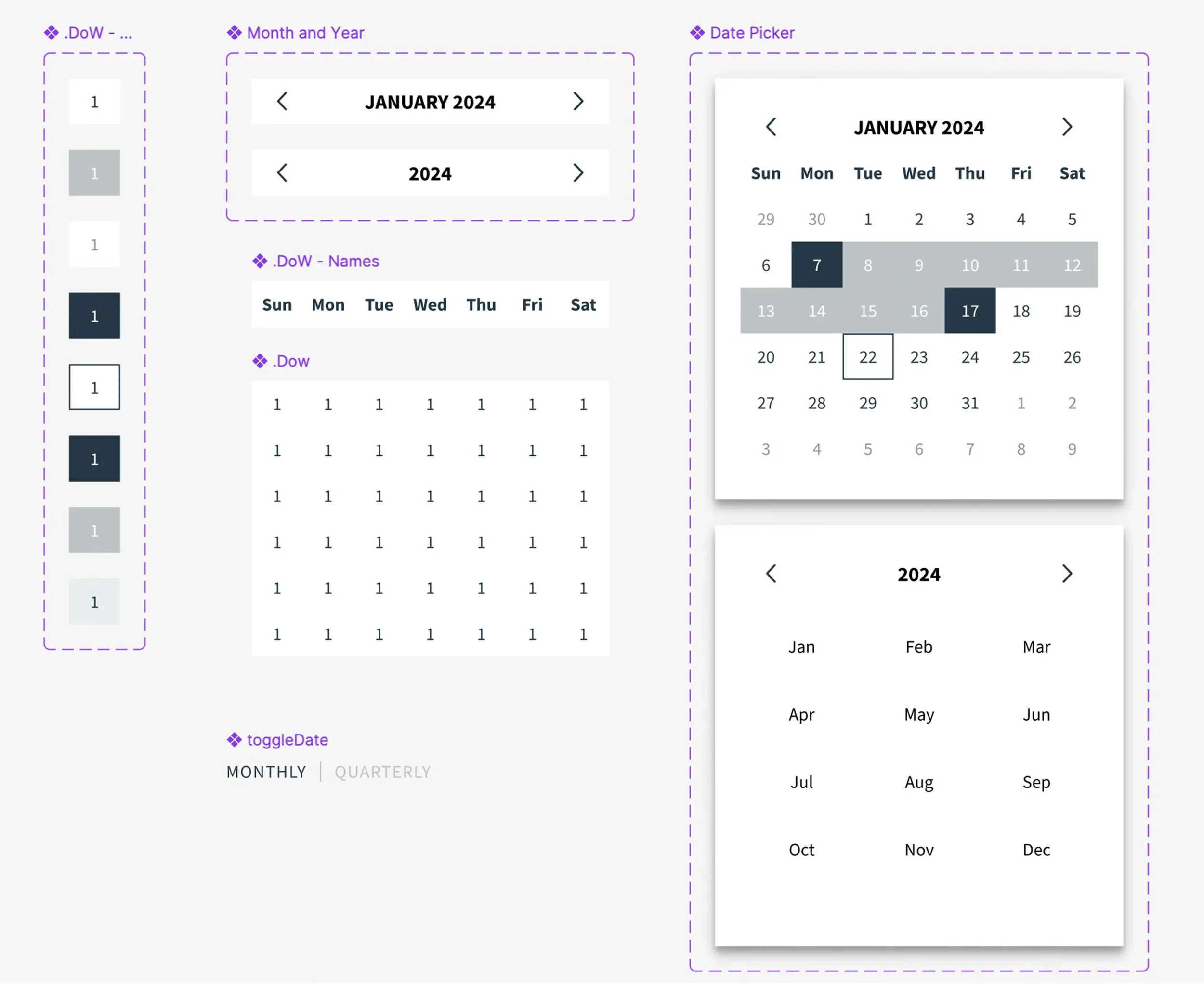
Calendar Variants
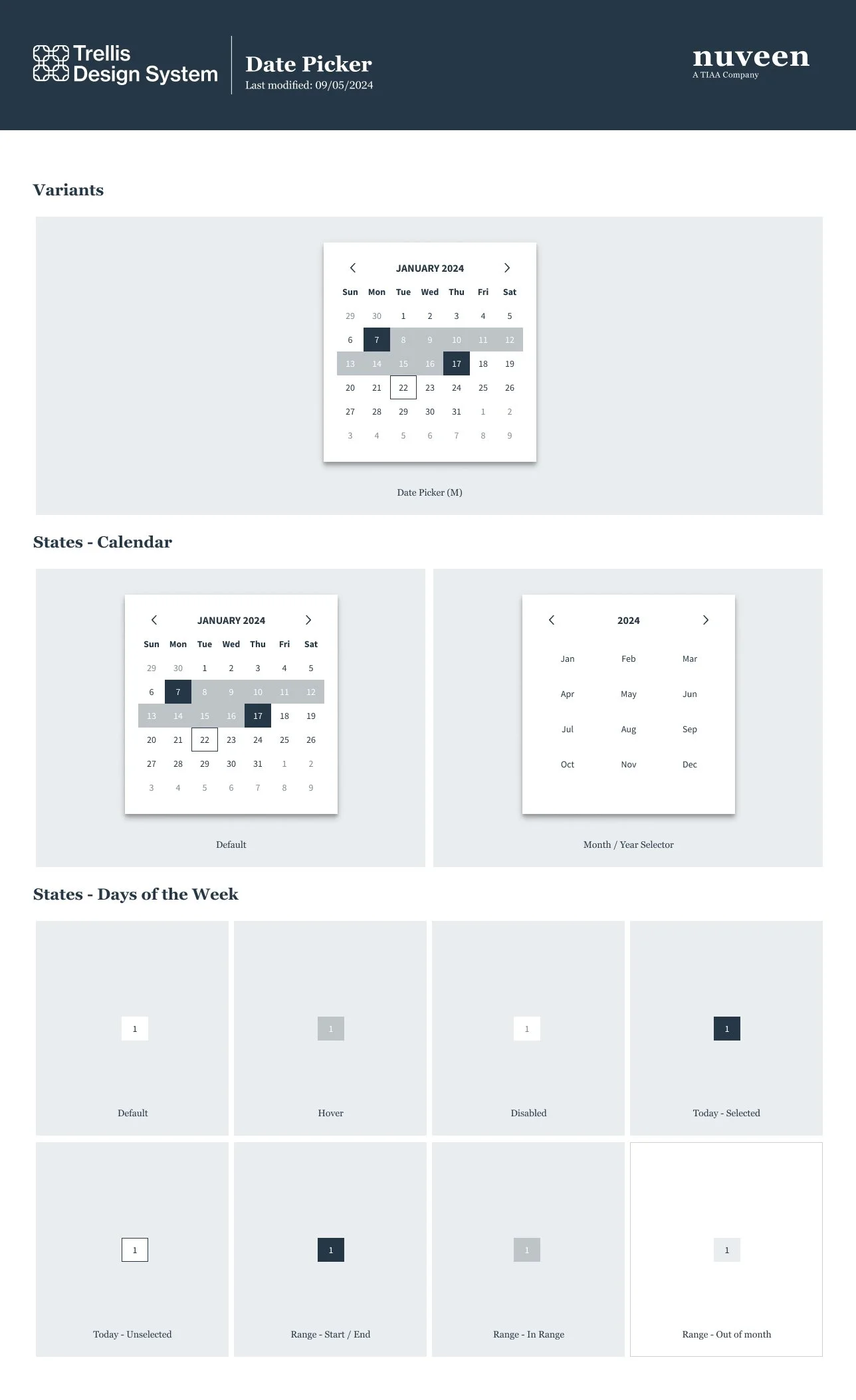
Calendar
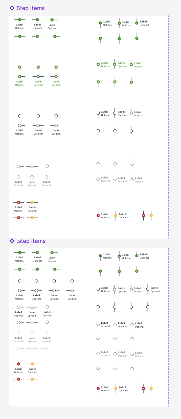
Stepper Variants
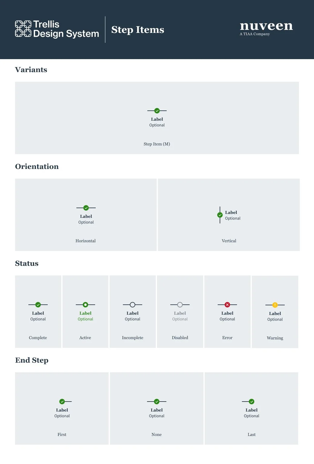
Stepper Items
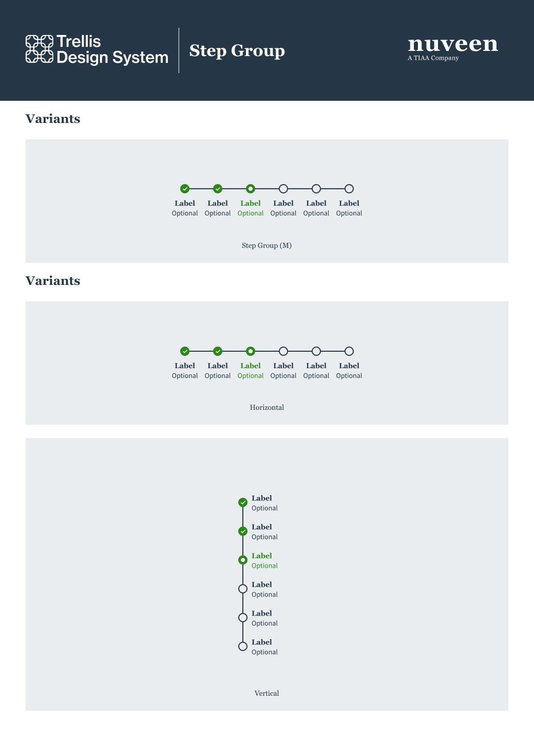
Stepper Groups
Delivered:
A topic scalable, and bespoke omni-channel experience; with CRM and web, driving traffic to multiple hubs, including our mobile app.
Measured business results in three areas
Omnichannel metrics
Business performance
Improved our business with investor long-term readiness, including saving, investing, planning, and advice engagement
Retirement contribution actions increased 105%
Investment reallocations and rebalancing rose 140%
Beneficiary updates increased 13%—evidence that participants applied what they learned to make meaningful financial decisions
Essentials by TIAA delivered against its objectives by turning credible guidance into confidence—and confidence into measurable financial action.
Life Essentials by TIAA proved with measured results that when financial education is designed with educational confidence, people act.
6 month performance
Current live site